Art Boards on Redbubble
I think my very favourite item to put my stuff on at Redbubble is the art board. Actually, I think it's the product view that I really like. What a nice, neat desk!
Adventures with Redbubble
Ok, first off, is it "Red Bubble" or "Redbubble"...? The latter probably. Either way, I finally started uploading files to Redbubble, I say finally because apparently I joined in August 2016. After the initial thrill of seeing photos of my images on stuff, I must admit that I find I'm quite discouraged by the whole process. There you are, a tiny grain of sand somewhere on Redbubble beach, who's going to know you're there, even? So, nevermind the constant "is this any good?" worry, now there's the "who's going to ever find this, let alone buy it?" worry. One post I read somewhere said they like Redbubble because that way they can buy t-shirts with their own stuff on them. Great. On the bright side, at least it gives me another reason to just keep making pictures. Some examples, below. And please, visit my shop if you're ever in the mood to buy a tote bag.
Spring weather.
Raining cats and dogs. Obviously. Hope the weather's nice for this year's Tulip Festival.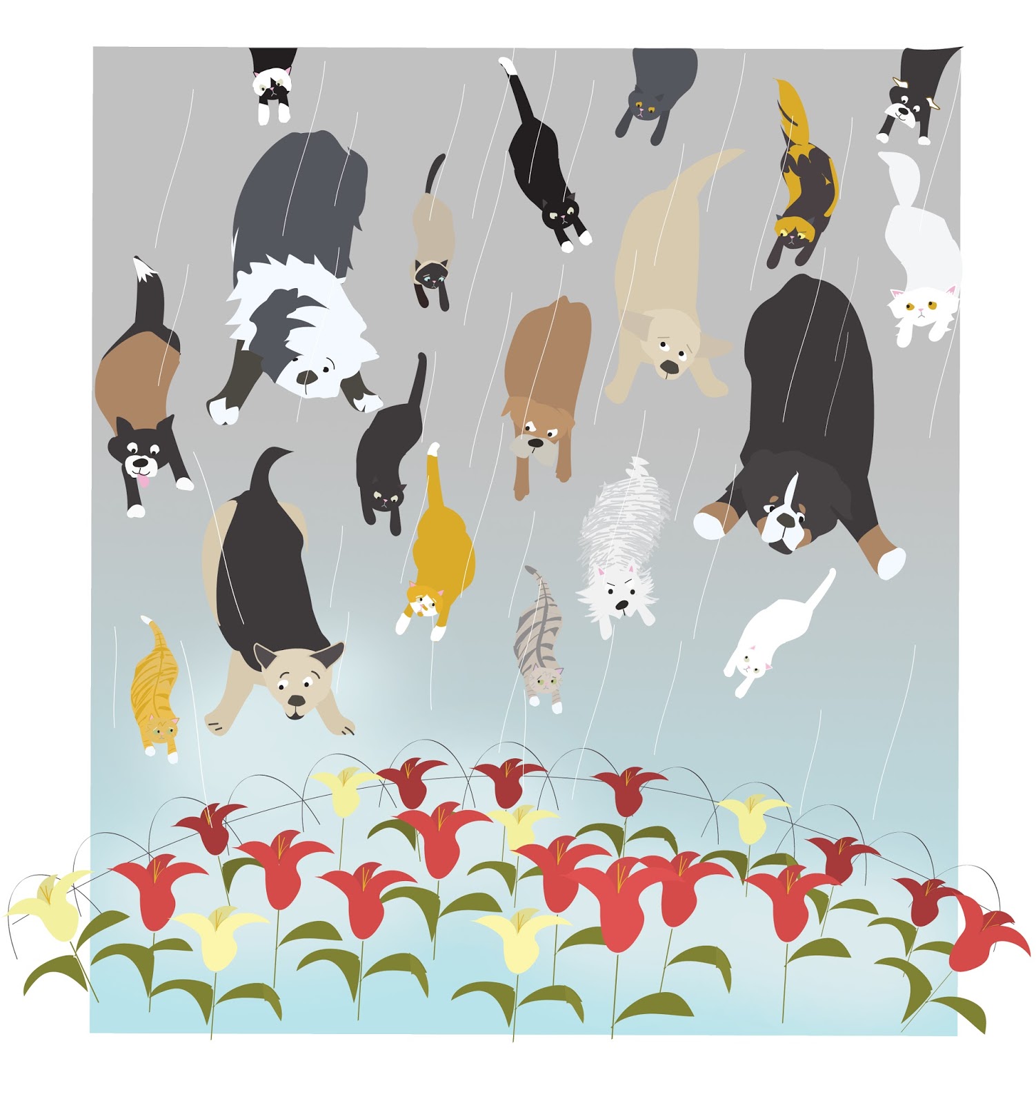

A palm reading.
A young girl worried about the upcoming school year seeks some reassurance from a family friend over tea.
Tom & Susan, 1963
This drawing prompt from 642 Things to Draw was "a prom dress". Prom seems like such an old fashioned idea to me (even though I think it's a big, important thing for lots of kids still), so I set this in 1963 with that deckled edge you used to get on printed photos.
Space Cat
I started this picture as a quick sketch to amuse my daughter on a short vacation. We talk about our cat Toodles (aka Seven, Alpha Seven, Alfie, Squishy, Squishers, etc) a lot - especially when we are away from him - and we like space cats. It's interesting how far a cat drawing can go: from note book to Illustrator to Photoshop. Just like a space cat, I guess.
A jungle
It's so easy to throw the baby out with the bath water... I have been looking through all these older 642 Things to Draw drawings, and reworking them in Illustrator and Photoshop, but I still like this one, as is. The drawing prompt was A jungle, and our cat Toodles immediately came to mind because he considers the neighbour's garden to be just that, a jungle.
Behind the Scenes
Swimming lessons
642 Things to Draw
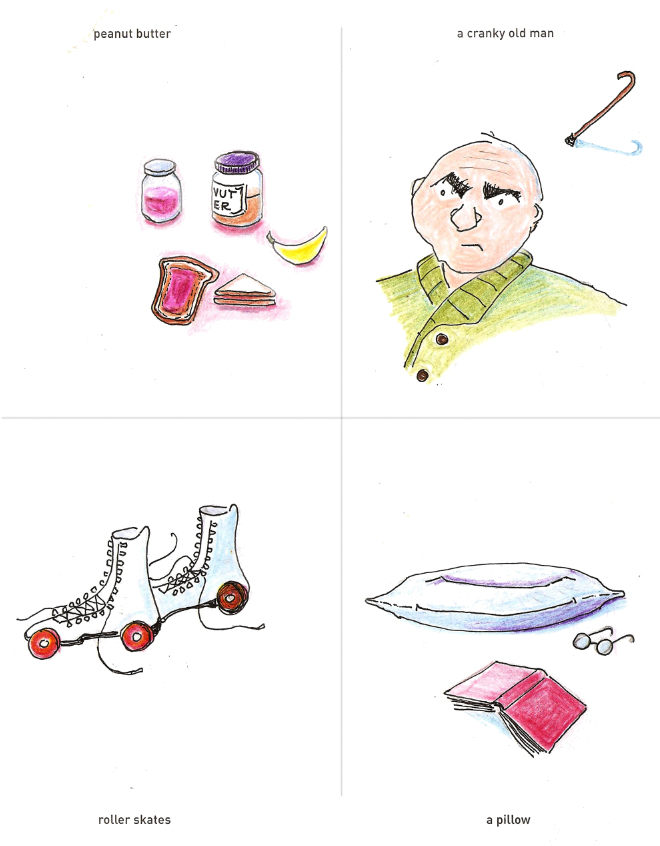 It gets kind of boring looking at all those digital drawings I did at school (multiple posts below). So for a change, here's a page of older on-paper-only ones. They're from that book 642 Things to Draw. The paper in the book is really nice, smooth and easily erased and stands up well to felt pen and lots of coloured pencil. I did photoshop-out those little imperfections you get when you scan something, but otherwise these drawings are as is, no photoshop or other.
Illustration for Spring
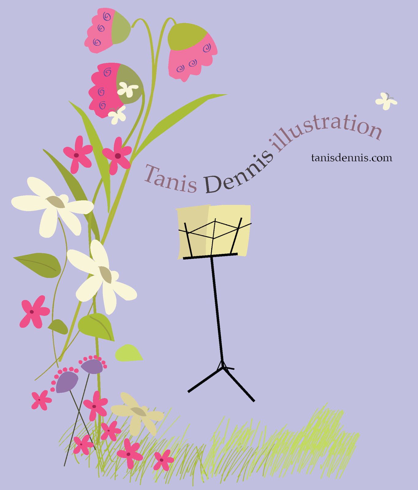 Always keep a native version of your work. When I first made this image, not only did I not know how to use the pen tool or the direct selection tool, I didn't even know enough to keep the image as an .ai file (it was saved as a jpeg only). So this image is a remake, doing it over properly in Illustrator meant I could change the colour palette easily (I wanted it still vector) and take out bits I didn't want, like the concert info. I'll probably make a winterized version too at some point.
 The "Way to go NYC" Project
The assignment was to design the characters and assets for a Candy Crush/Match 3 style game for a hand held game.
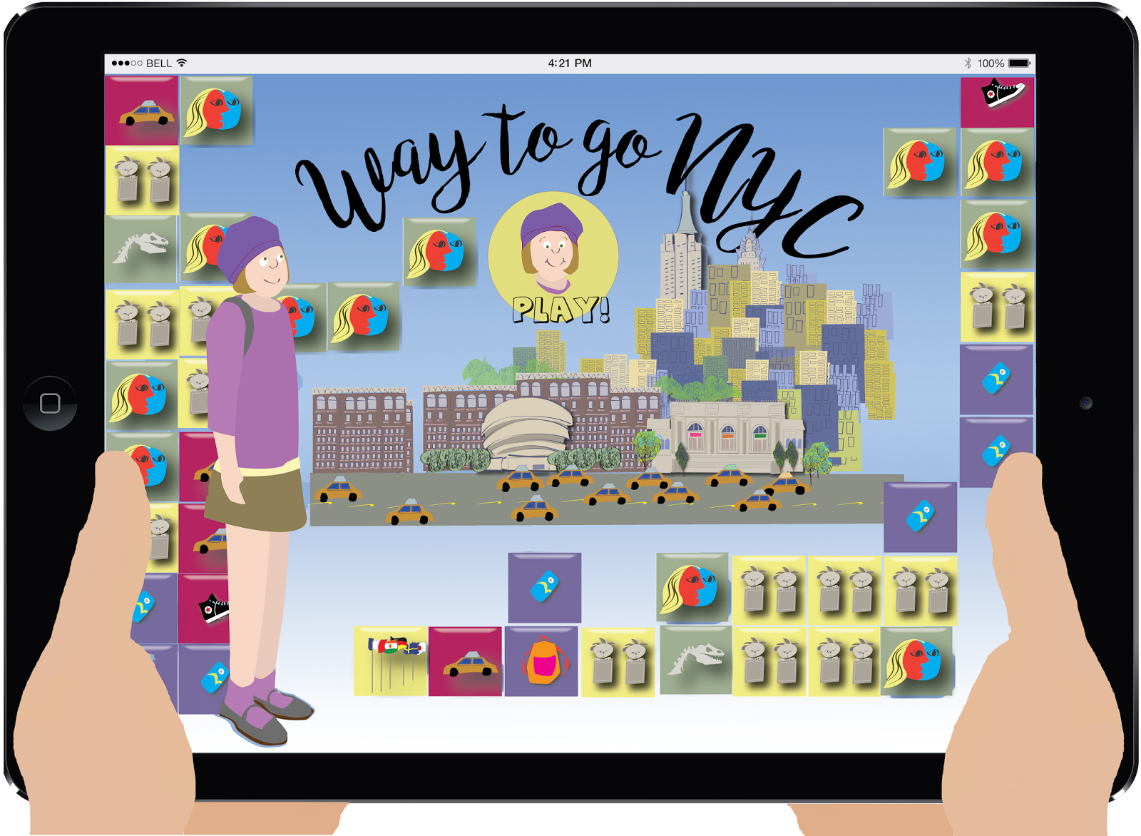
I did so many iterations of the illustrations for this game. All of them are really more "print" than "handheld game", regardless of how they're framed here. Not being a huge hand held game person, I do like to remind myself that "Interactive Media" does include printed books.


These are the more hand held-ish ones. They don't have more of a "digital game" feel, but I've framed them that way. There are lots of electronic games for kids that use a quite flat illustration style, for example these SagoMini games.

Sophie Takes Manhattan - One pager
This is a one page (double sided) handout from a pitch package for a series of travel guides for kids. The one pager shows the first title "Sophie Takes Manhattan" which is a spin off from the Way to go NYC hand held game. The back page reads:
In this first in a series of travel guides for kids, "Sophie" visits major cities around the globe. Each guide provides a child's view of the museums, art galleries, historic buildings and monuments adults may be eager to visit but fear they will have to "drag their kids" along to see. By becoming acquainted with the sites beforehand, kids can help plan a family vacation that includes something for everyone.
Kid friendly maps and lists of unique eating spots which kids will love are included in each guide. A passport cover featuring Sophie and an ipad/ipod game called "Way to Go NYC!" augment the IP.
Ages 6-10
Find Toodles - Isometric Game
Another hand held game, illustrations for the screens, characters and asset sheets.
These illustrations are done in isometric perspective, which should be an easy way to work, but it can also be tricky. You don't need to establish vanishing points or draw all those convergence lines, but can be hard to force one's mind not to make lines converge, even though you are using a grid.
These illustrations are done in isometric perspective, which should be an easy way to work, but it can also be tricky. You don't need to establish vanishing points or draw all those convergence lines, but can be hard to force one's mind not to make lines converge, even though you are using a grid.
The advantage is that once you make an object (or character) you can place it anywhere in the picture, which is why isometric perspective is used in certain types of video games. Also excellent for maps of floor layouts. I based these drawings on my kids, cat and our house.
Dave goes to Work
Baby's First Year
The brief was to illustrate a CandyLand style game, not for kids but for adults. Ignoring the "Adult Content" connotations, I decided to do an infographic called "Baby's First Year". It's suitable for hanging on the wall of a Well Baby clinic or Pediatrician's office. There's a game board, game cards and players cards.
Painting in Photoshop
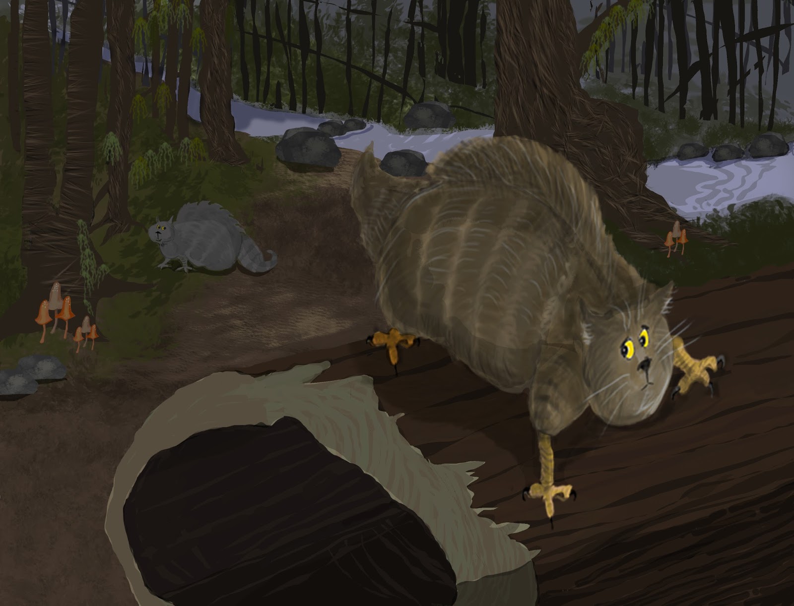
These were made in Photoshop. So many people swear by Photoshop. I do like working this way - with brushes instead of vector based shapes - but I really appreciate the fact that illustrator files are infinitely scalable. I also like the way my illustrator files look printed on paper, they seem truer to the digital files, whereas I think my photoshop images look best on a screen. Sometimes I take an illustrator file into Photoshop, especially for backgrounds, but these ones are pure Photoshop.
Room view
Subscribe to:
Comments (Atom)


